swiper.js自己去官网下载哈。
先来一个tab切换案例:
demo.html
<!doctype html>
<htmlhead>
    Meta charset="utf-8"name="viewport" content="width=device-width,initial-scale=1,maximum-scale=1,minimum-scale=1,user-scalable=no,minimal-ui"title>Swiper Demo</link rel="stylesheet" type="text/css" href="../js/swiper/idangerous.swiper2.7.6.css"="../css/index.css"body>

div class="swiper-container"="swiper-wrapper">
        ="swiper-slide bg-1png"></div="swiper-slide bg-2png"="swiper-slide bg-3png"="swiper-slide bg-4png"="tabs"a href="" class="active">首页a="">课程>发现>我的script type="text/javascript" src="../js/jquery/jquery-1.10.1.min.js"script="../js/swiper/idangerous.swiper2.7.6.min.js"="../js/index.js">
index.js
var swiper = new Swiper(".swiper-container",{
    onSlideChangeStart: function(swiper) {
        var index = swiper.activeIndex;
        $(".tabs a").removeClass("active");
        $(".tabs a").eq(index).addClass("active");
    }
});

$(".tabs a").click((e){
    e.preventDefault();
    var index = $(this).index();
    $(".tabs a").removeClass("active");
    $(this).addClass("active");
    swiper.swipeTo(index);
    return false;
});
swipper杂七杂八知识点补充:
/*垂直滚动:Demo1*/

});

Progress插件:Demo2true(swiper){
        for (var i = 0; i < swiper.slides.length; i++){
          var slide = swiper.slides[i];
          var progress = slide.progress;
          var scale,translate,opacity;
          if (progress<=0) {
            opacity = 1 - Math.min(Math.abs(progress),1);
            scale = 1 - Math.min(Math.abs(progress/2),1);
            translate = progress*swiper.width;
          }
          else {
            opacity = 1 - Math.min(Math.abs(progress/2),1);
            scale=1;
            translate=0;
          }
          slide.style.opacity = opacity;
          swiper.setTransform(slide,'translate3d('+(translate)+'px,0) scale('+scale+')');
        }
      },onTouchStart:){
          swiper.setTransition(swiper.slides[i],0(swiper,speed) {
        // Set Z-Indexes
  ){
    swiper.slides[i].style.zIndex = swiper.slides.length - i;
  }

3D Flow 插件使用:Demo3scroll Bar 插件使用: Demo4
    }
});

Tab 综合示例 :Demo5;
});
WebApp综合案例:
首先是移动端效果:
然后是pc端效果
index.html
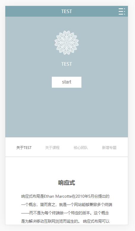
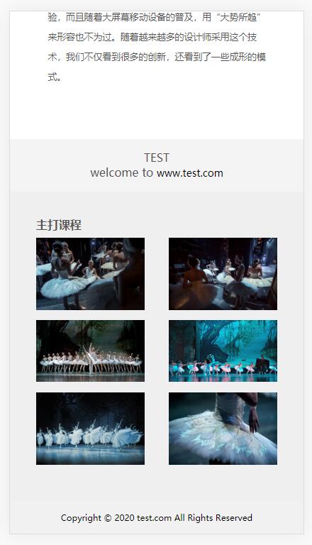
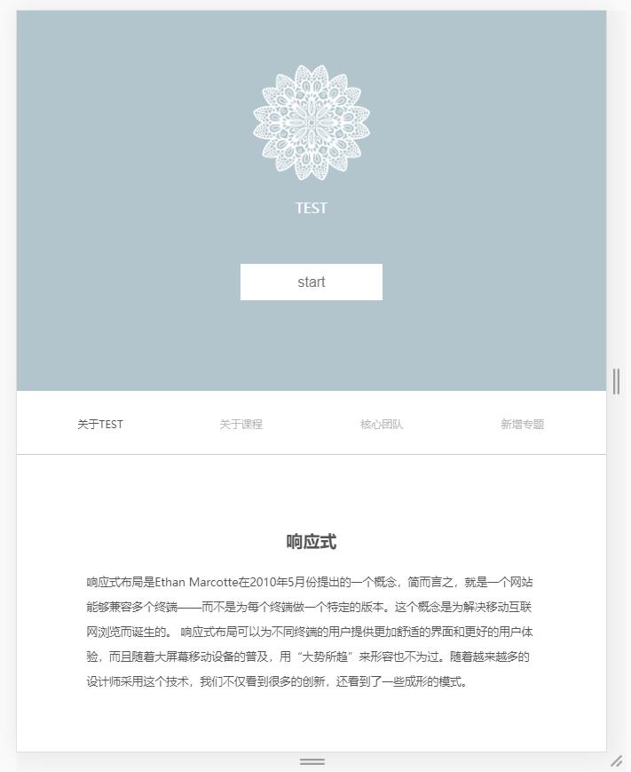
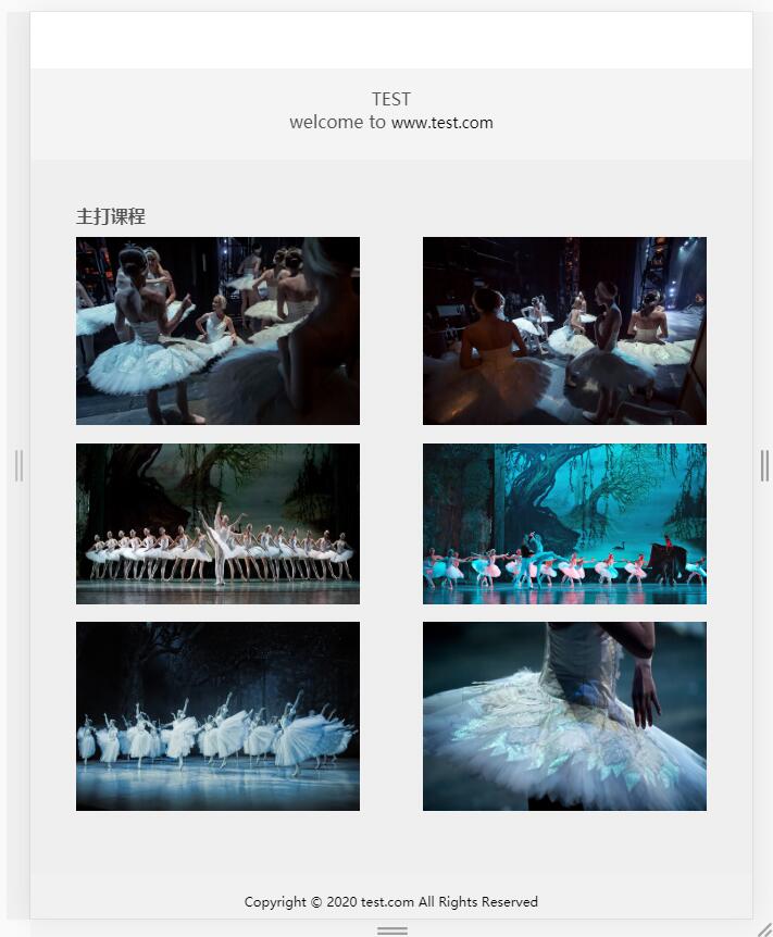
DOCTYPE htmlhtml lang="en"="UTF-8">index="css/base.css"="css/grid.css"="css/index.css"<!-- 第一区域 --> ="container1" ipad导航 --> nav ="nav-container col-md-12 d-none d-md-block"> ul ="nav col-md-8 col-offset-2 "> li ="nav-item"> ="###"="nav-link nav-link-active">前端li="nav-link">java>ios>Android>PHPulnav 移动端导航 ="nav-container nav-container-sm d-md-none" id="nav"="nav-container-wrap"p>TEST="nav-container-sm-right"><img id="toggle-btn"="img/zhankai.svg" alt="container-sm"="nav-link-sm" 内容 ="container1-content"src="img/1.png"p ="img1-p"button>start 第二区域 ="container2"="container2-nav col-md-12"="container2-nav-item">关于TEST>关于课程>核心团队>新增专题 第三区域 ="container3 col-md-12"="container3-content col-md-8 col-md-offset-2"h2>响应式="container3-content-p">响应式布局是Ethan Marcotte在2010年5月份提出的一个概念,简而言之,就是一个网站能够兼容多个终端——而不是为每个终端做一个特定的版本。这个概念是为解决移动互联网浏览而诞生的。 响应式布局可以为不同终端的用户提供更加舒适的界面和更好的用户体验,而且随着大屏幕移动设备的普及,用“大势所趋”来形容也不为过。随着越来越多的设计师采用这个技术,我们不仅看到很多的创新,还看到了一些成形的模式。 第四区域 ="container4 col-md-12"="container4-left"="container4-right">welcome to ="#">www.test.com 第五区域 ="container5 col-md-12"h3>主打课程="container5-content"="container5-content-img"="img/1.jpg"="img/2.jpg"="img/3.jpg"="img/4.jpg"="img/5.jpg"="img/6.jpg" 第六区域 ="container6 col-md-12">Copyright © 2020 test.com All Rights Reserved="js/jquery-1.10.1.min.js"="js/index.js">
base.css
* {Box-sizing: border-Box; padding: 0; margin: 0; }
html {font-size:16px; }
li {list-style: none; }
a { 14px; color: #363636; text-decoration:
a:hover {color: #1428a0; }
img {vertical-align: top; width: 100%; height:100%; border: none; }
grid.css
.container {

    width:

    padding-left: 15px;

    padding-right:

    margin-left: auto;

    margin-right: auto;

}


.row { -15px; -15px;

}


.col-1,.col-2,.col-3,.col-4,.col-5,.col-6,.col-7,.col-8,.col-9,.col-10,.col-11,.col-12,.col-sm-1,.col-sm-2,.col-sm-3,.col-sm-4,.col-sm-5,.col-sm-6,.col-sm-7,.col-sm-8,.col-sm-9,.col-sm-10,.col-sm-11,.col-sm-12,.col-md-1,.col-md-2,.col-md-3,.col-md-4,.col-md-5,.col-md-6,.col-md-7,.col-md-8,.col-md-9,.col-md-10,.col-md-11,.col-md-12,.col-lg-1,.col-lg-2,.col-lg-3,.col-lg-4,.col-lg-5,.col-lg-6,.col-lg-7,.col-lg-8,.col-lg-9,.col-lg-10,.col-lg-11,.col-lg-12,.col-xl-1,.col-xl-2,.col-xl-3,.col-xl-4,.col-xl-5,.col-xl-6,.col-xl-7,.col-xl-8,.col-xl-9,.col-xl-10,.col-xl-11,.col-xl-12 {

    position: relative; 15px;

}

    float: left;

}

.col-1 { 8.33333333%;

}

.col-2 { 16.66666667%;

}

.col-3 { 25%;

}

.col-4 { 33.33333333%;

}

.col-5 { 41.66666667%;

}

.col-6 { 50%;

}

.col-7 { 58.33333333%;

}

.col-8 { 66.66666667%;

}

.col-9 { 75%;

}

.col-10 { 83.33333333%;

}

.col-11 { 91.66666667%;

}

.col-12 { 100%;

}


.col-offset-12 {

.col-offset-11 {

.col-offset-10 {

.col-offset-9 {

.col-offset-8 {

.col-offset-7 {

.col-offset-6 {

.col-offset-5 {

.col-offset-4 {

.col-offset-3 {

.col-offset-2 {

.col-offset-1 {

.col-offset-0 { 0;

}


.col-pull-12 {

    right:

.col-pull-11 {

.col-pull-10 {

.col-pull-9 {

.col-pull-8 {

.col-pull-7 {

.col-pull-6 {

.col-pull-5 {

.col-pull-4 {

.col-pull-3 {

.col-pull-2 {

.col-pull-1 {

.col-pull-0 {

.col-push-12 {

    left:

.col-push-11 {

.col-push-10 {

.col-push-9 {

.col-push-8 {

.col-push-7 {

.col-push-6 {

.col-push-5 {

.col-push-4 {

.col-push-3 {

.col-push-2 {

.col-push-1 {

.col-push-0 { auto;

}


sm*/

@media (min-width: 576px) {

    .col-sm-1,.col-sm-12 {

        float: left;

    }

    .col-sm-1 {

        width: 8.33333333%;

    }

    .col-sm-2 { 16.66666667%;

    }

    .col-sm-3 { 25%;

    }

    .col-sm-4 { 33.33333333%;

    }

    .col-sm-5 { 41.66666667%;

    }

    .col-sm-6 { 50%;

    }

    .col-sm-7 { 58.33333333%;

    }

    .col-sm-8 { 66.66666667%;

    }

    .col-sm-9 { 75%;

    }

    .col-sm-10 { 83.33333333%;

    }

    .col-sm-11 { 91.66666667%;

    }

    .col-sm-12 { 100%;

    }


    .col-sm-offset-12 {

        margin-left:

    .col-sm-offset-11 {

    .col-sm-offset-10 {

    .col-sm-offset-9 {

    .col-sm-offset-8 {

    .col-sm-offset-7 {

    .col-sm-offset-6 {

    .col-sm-offset-5 {

    .col-sm-offset-4 {

    .col-sm-offset-3 {

    .col-sm-offset-2 {

    .col-sm-offset-1 {

    .col-sm-offset-0 { 0;

    }


    .col-sm-pull-12 {

        right:

    .col-sm-pull-11 {

    .col-sm-pull-10 {

    .col-sm-pull-9 {

    .col-sm-pull-8 {

    .col-sm-pull-7 {

    .col-sm-pull-6 {

    .col-sm-pull-5 {

    .col-sm-pull-4 {

    .col-sm-pull-3 {

    .col-sm-pull-2 {

    .col-sm-pull-1 {

    .col-sm-pull-0 { auto;

    }

    .col-sm-push-12 {

        left:

    .col-sm-push-11 {

    .col-sm-push-10 {

    .col-sm-push-9 {

    .col-sm-push-8 {

    .col-sm-push-7 {

    .col-sm-push-6 {

    .col-sm-push-5 {

    .col-sm-push-4 {

    .col-sm-push-3 {

    .col-sm-push-2 {

    .col-sm-push-1 {

    .col-sm-push-0 {

}

md

@media (min-width: 768px) {

    .col-md-1,.col-md-12 {

        float:

    .col-md-1 {

    .col-md-2 {

    .col-md-3 {

    .col-md-4 {

    .col-md-5 {

    .col-md-6 {

    .col-md-7 {

    .col-md-8 {

    .col-md-9 {

    .col-md-10 {

    .col-md-11 {

    .col-md-12 {


    .col-md-offset-12 {

    .col-md-offset-11 {

    .col-md-offset-10 {

    .col-md-offset-9 {

    .col-md-offset-8 {

    .col-md-offset-7 {

    .col-md-offset-6 {

    .col-md-offset-5 {

    .col-md-offset-4 {

    .col-md-offset-3 {

    .col-md-offset-2 {

    .col-md-offset-1 {

    .col-md-offset-0 {


    .col-md-pull-12 {

    .col-md-pull-11 {

    .col-md-pull-10 {

    .col-md-pull-9 {

    .col-md-pull-8 {

    .col-md-pull-7 {

    .col-md-pull-6 {

    .col-md-pull-5 {

    .col-md-pull-4 {

    .col-md-pull-3 {

    .col-md-pull-2 {

    .col-md-pull-1 {

    .col-md-pull-0 {

    .col-md-push-12 {

    .col-md-push-11 {

    .col-md-push-10 {

    .col-md-push-9 {

    .col-md-push-8 {

    .col-md-push-7 {

    .col-md-push-6 {

    .col-md-push-5 {

    .col-md-push-4 {

    .col-md-push-3 {

    .col-md-push-2 {

    .col-md-push-1 {

    .col-md-push-0 {lg

@media (min-width: 992px) {

    .col-lg-1,.col-lg-12 {

        float:

    .col-lg-1 {

    .col-lg-2 {

    .col-lg-3 {

    .col-lg-4 {

    .col-lg-5 {

    .col-lg-6 {

    .col-lg-7 {

    .col-lg-8 {

    .col-lg-9 {

    .col-lg-10 {

    .col-lg-11 {

    .col-lg-12 {


    .col-lg-offset-12 {

    .col-lg-offset-11 {

    .col-lg-offset-10 {

    .col-lg-offset-9 {

    .col-lg-offset-8 {

    .col-lg-offset-7 {

    .col-lg-offset-6 {

    .col-lg-offset-5 {

    .col-lg-offset-4 {

    .col-lg-offset-3 {

    .col-lg-offset-2 {

    .col-lg-offset-1 {

    .col-lg-offset-0 {


    .col-lg-pull-12 {

    .col-lg-pull-11 {

    .col-lg-pull-10 {

    .col-lg-pull-9 {

    .col-lg-pull-8 {

    .col-lg-pull-7 {

    .col-lg-pull-6 {

    .col-lg-pull-5 {

    .col-lg-pull-4 {

    .col-lg-pull-3 {

    .col-lg-pull-2 {

    .col-lg-pull-1 {

    .col-lg-pull-0 {

    .col-lg-push-12 {

    .col-lg-push-11 {

    .col-lg-push-10 {

    .col-lg-push-9 {

    .col-lg-push-8 {

    .col-lg-push-7 {

    .col-lg-push-6 {

    .col-lg-push-5 {

    .col-lg-push-4 {

    .col-lg-push-3 {

    .col-lg-push-2 {

    .col-lg-push-1 {

    .col-lg-push-0 {xl

@media (min-width: 1200px) {

    .col-xl-1,.col-xl-12 {

        float:

    .col-xl-1 {

    .col-xl-2 {

    .col-xl-3 {

    .col-xl-4 {

    .col-xl-5 {

    .col-xl-6 {

    .col-xl-7 {

    .col-xl-8 {

    .col-xl-9 {

    .col-xl-10 {

    .col-xl-11 {

    .col-xl-12 {


    .col-xl-offset-12 {

    .col-xl-offset-11 {

    .col-xl-offset-10 {

    .col-xl-offset-9 {

    .col-xl-offset-8 {

    .col-xl-offset-7 {

    .col-xl-offset-6 {

    .col-xl-offset-5 {

    .col-xl-offset-4 {

    .col-xl-offset-3 {

    .col-xl-offset-2 {

    .col-xl-offset-1 {

    .col-xl-offset-0 {


    .col-xl-pull-12 {

    .col-xl-pull-11 {

    .col-xl-pull-10 {

    .col-xl-pull-9 {

    .col-xl-pull-8 {

    .col-xl-pull-7 {

    .col-xl-pull-6 {

    .col-xl-pull-5 {

    .col-xl-pull-4 {

    .col-xl-pull-3 {

    .col-xl-pull-2 {

    .col-xl-pull-1 {

    .col-xl-pull-0 {

    .col-xl-push-12 {

    .col-xl-push-11 {

    .col-xl-push-10 {

    .col-xl-push-9 {

    .col-xl-push-8 {

    .col-xl-push-7 {

    .col-xl-push-6 {

    .col-xl-push-5 {

    .col-xl-push-4 {

    .col-xl-push-3 {

    .col-xl-push-2 {

    .col-xl-push-1 {

    .col-xl-push-0 {

}


.d-none {

    display: none !important;

}

.d-block { block !important;

}


    .d-sm-none {

        display: none !important;

    }

    .d-sm-block {

        display: block !important;

    }

    .d-md-none {

        display:

    .d-md-block {

    .d-lg-none {

        display:

    .d-lg-block {

    .d-xl-none {

        display:

    .d-xl-block {

}


.clearfix:after,.clearfix:before,.container:after,.container:before,.row:after,.row:before { table;

    content: ' ';

}

.clearfix:after,.row:after {

    clear: both;

}
index.css
第一区域
.container1{
    width:
    height:60vh;
    background-color: #B2C5CC;
}
.nav{
    display: flex;
    padding:3vh 0;
}
.nav-item{20%;
    text-align: center;
}
.nav-link{
    font-size:1rem;
    color:#757575;
}
.nav-link-active{orange;#afafaf;
}
移动端导航
.nav-container-sm{white;
    text-align: center;
    position: absolute; 100%;
}
.nav-container-wrap{ #7EA6B1;1vh 0;
}
.nav-container-sm-right{
     position:
     right:10px;
     top:8px;
     width:5%;
}
.container-sm{ none;
}
.nav-container-sm li{
    border-bottom:1px solid white;
.nav-container-sm li:last-child{none;
}
.nav-link-sm{white;
}
内容部分
.container1-content{
    padding-top: 20%;
}
.container1-content img{20%;
}
.container1-content p{ white;
    margin-top: 20px; 1rem;
}
.container1-content button{ 8%; 24%; 5vh;
    border: none; 1.2rem;
    line-height:#757575;
}
第二区域
.container2-nav{1px solid #ccc;
}
.container2-nav-item{25%;
.container2-nav-item .nav-link{#bababa;
}
.container2-nav-item .nav-link-active{#545454;
}
.container2-content{ 10%;
}
第三区域
.container3{10vh 0;
.container3-content p{ 1rem; left; 1.8rem;
}
第四区域
.container4{2vh 5vh; rgb(244,244,244);
.container4-left{
    float:left;
}
.container4-right{right;
}
.container4-right a{black;
}
第五区域
.container5{ rgb(239,239,239);5vh;
.container5-content{
    flex-wrap: wrap;
    justify-content: space-between;1vh;
}
.container5-content-img{30%;
    margin-bottom:2vh;
}
第六区域
.container6{ rgb(241,241,241); 1.1rem; 2vh; center;
}
移动端调整
@media (max-width: 767px) {
    */
    .container1-content button {
        font-size:1rem;
    }

    .container2-nav-item .nav-link{
        font-size: .6rem;
    }

    .container3 h2{1.2rem;
    }
    .container3-content p { .8rem;
        line-height: 1.8rem;
        padding: 0 10%;
    }

    .container4{
        height:10vh;
        text-align: center;
    }
    .container4-left {
        float: none;
    }
    .container4-right { none;
    }

    .container5-content-img {
        width: 45%;
    }
    .container5 h3{
    .container6{.7rem;
    }
}
index.js
$((){
    $("#toggle-btn").on('click',(){
        if($(this).attr('src')=='img/zhankai.svg'){
            $(this).attr('src','img/guanbi.svg');
            $(".container-sm").slideDown();
        }{
            $().slideUp();
        }
    })
});
