我想创建一个发光加载动画,该动画将出现在具有不同背景颜色的多个元素上.
当前,我正在使用背景图像渐变,并且正在使用vw单位为背景位置设置动画,但是它不可缩放,我的元素将具有不同的长度.
有没有一种方法可以使背景图像具有百分比单位?
创建的动画
body {
  background: black;
}

header {
  width: 100%;
  height: 50px;
  background-color: rebeccapurple;
  background-image: linear-gradient(
    to right,transparent 0%,rgba(255,255,0.3) 50%,transparent 100%
  );
  background-repeat: no-repeat;
  background-position: -100vw;
  animation: shine 2s infinite;
}

@keyframes shine {
  0% {
    background-position: -100vw;
  }
  100% {
    background-position: 100vw;
  }
}
<!DOCTYPE html>
<html>
<head>
<Meta charset="utf-8">
<Meta name="viewport" content="width=device-width">
<title>JS Bin</title>
<script src="https://code.jquery.com/jquery-3.1.0.js"></script>
</head>
<body>
<header></header>
</body>
</html>最佳答案
一个想法是使渐变的大小比容器大3倍,并对容器的中间部分进行着色,然后从左向右滑动它:
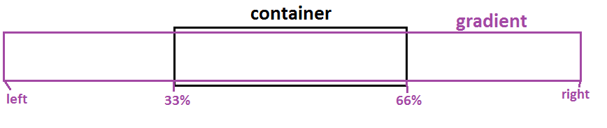
body {
  background: black;
}

.Box {
  height: 50px;
  margin:5px;
  background-color: rebeccapurple;
  background-image: linear-gradient(
    to right,transparent 33%,transparent 66%
  );
  background-size:300% 100%;
  animation: shine 2s infinite;
}

@keyframes shine {
  0% {
    background-position: right;
  }
  /*100% {
    background-position: left; it's the default value,no need to define it
  }*/
}
<div class="Box"></div>
<div class="Box" style="width:60%"></div>
<div class="Box" style="width:40%"></div>相关问题:Using percentage values with background-position on a linear gradient
