背景:
我正在尝试使用Grid CSS并尝试使用当前可实现扩展的布局
预期布局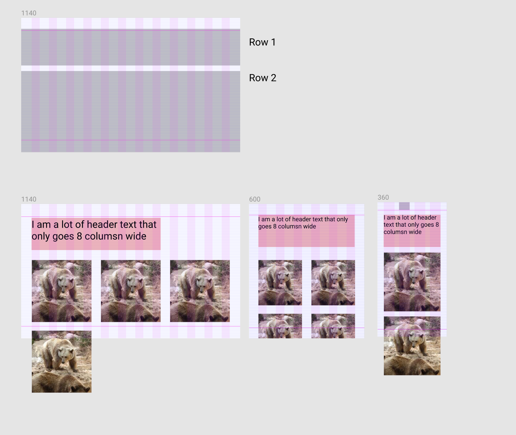
问题:
在桌面上,元素标题应该是8列宽,如果我没有将网格行添加到元素标题和元素而不是< div class =“element”> 1< / div>将填写元素标题旁边的内容.现在,如果我添加网格行,我的元素将不再包装.
当前布局(问题)

题
如何修复我的网格以匹配上面的“预期布局”屏幕截图?
即.element将在第二个网格行上换行并开始
码:
HTML:
CSS:
.section {
  width: 100%;
  display: block;
  background: red;
  Box-sizing: border-Box;
  padding: 40px 24px;

  @media screen and (min-width: 600px) and (max-width: 1139px) {
    background: orange;
    padding: 56px 48px;
  }

  @media screen and (min-width: 1140px) {
    padding: 64px 48px;
    background: green;
  }
}

.container {
  margin: 0 auto;
  background: rgba(244,244,.25);
  max-width: 599px;

  @media screen and (min-width: 600px) and (max-width: 1139px) {
    max-width: 1039px;
    background: rgba(244,.25);
  }

  @media screen and (min-width: 1140px) {
    max-width: 1032px;
    background: rgba(244,.25);
  }
}

.samba-grid {
  display: grid;
  background: inherit;
  width: 100%;
  grid-template-columns: repeat(4,1fr);
  grid-template-rows: 'auto auto';
  grid-gap: 24px;

  @media screen and (min-width: 600px) and (max-width: 1139px) {
    grid-template-columns: repeat(6,1fr);
    grid-gap: 48px;
  }

  @media screen and (min-width: 1140px) {
    grid-template-columns: repeat(12,1fr);
    grid-gap: 48px;
  }
}

h1 {
  font-size: 52px;
}
.element-header {
  grid-row: 1;
  grid-column: span 8; // SET THIS TO "span 12" TO SEE EXPECTED BEHAVIOR
}

.element {
  display: grid; // important to do this.
  background: rgba(0,.3);
  grid-column: span 3;
  grid-row: 2; // REMOVE THIS TO SEE EXPECTED BEHAVIOR

  @media screen and (min-width: 600px) and (max-width: 1139px) {
    grid-column: span 3;
  }

  @media screen and (min-width: 1140px) {
    grid-column: span 4;
  }
}
最佳答案
您可以使文本占据整行,然后在内部减小其宽度,使其仅占用所需的宽度.就像那样,你将阻止第一行,没有任何元素可以去那里.
这是一个简化的例子:
.samba-grid {
  display: grid;
  background: inherit;
  width: 100%;
  grid-template-columns: repeat(12,1fr);
  grid-gap: 24px;
  border:1px solid;
}

.element-header {
  grid-row: 1;
  grid-column: 1/-1;
}
.element-header > h1 {
  /*we take 8 colmuns (without gaps) + 7 gaps*/
  width:calc(8*(100% - 11*24px)/12 + 7*24px);
  background:red;
  margin:0;
}
.samba-grid > span {
  height:50px;
  grid-column: span 2;
  background:green;
}
为了使其更加动态和易于处理,您可以考虑使用CSS变量:
:root {
--grid:12;
--gap:24px;
}
.samba-grid {
display: grid;
background: inherit;
width: 100%;
grid-template-columns: repeat(var(--grid),1fr);
grid-gap: var(--gap);
border:1px solid;
}
.element-header {
grid-row: 1;
grid-column: 1/-1;
--grid-column:8; /*simply adjust this value to control the column*/
}
.element-header > h1 {
width:calc(var(--grid-column)*(100% - (var(--grid) - 1)*var(--gap))/var(--grid) + calc(var(--grid-column) - 1)*var(--gap));
background:red;
margin:0;
}
.samba-grid > span {
height:50px;
grid-column: span 2;
background:green;
}
另一个想法是考虑一个隐藏元素,它将占用第一行的剩余空间:
.samba-grid {
display: grid;
background: inherit;
width: 100%;
grid-template-columns: repeat(12,1fr);
grid-gap: 24px;
border:1px solid;
}
.element-header {
grid-row: 1;
grid-column: span 8;
background:red;
order:-2;
}
.samba-grid:before {
content:"";
order:-1;
grid-column: span 4;
background:blue;
height:2px;
}
.samba-grid > span {
height:50px;
grid-column: span 2;
background:green;
}
作为旁注,设置grid-row:2并不意味着从第二行开始,但它意味着在创建问题的第二行内.
