来自:授权地址
作者:水牛01248
几个横排元素在竖直方向上居中
display: flex;
flex-direction: row;//横向排列
align-items: center;//垂直方向上居中
在母控件的正中:相当于android中的RelativeLayout的
display: flex;
flex-direction: row;//横向排列
justify-content: center;//水平居中
align-items: center;//垂直方向上居中
自定义modal的一个标题栏,带图标的标题居中,右边有关闭按钮

绕的一个坑: 中间的用div包裹,flex布局可实现centerInParent效果,右边的用position:
absolute;right: 0.75rem,可以实现关闭按钮在右边,但是脱离的文档流,居中不好弄. 能不能不脱离flex的文档流?
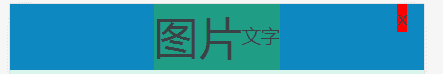
可以的,左边加一个空的div,就可以对称了,用flex布局的justify-content: space-between,就能均匀排列了.
<div style="display: flex;flex-direction: row;justify-content: space-between;align-items: center;
            align-content: center;background-color: #0d88c1;padding-left: 0.75rem;padding-right: 0.75rem">
                <div></div>
                <div style="display: flex;flex-direction: row;justify-content: center;align-items: center;background-color: #1f9d85">
                    <div style="font-size: 2rem">图片</div>
                    <div >文字</div>
                </div>
                <div style="background-color: red;">x</div>
            </div>
同理,利用justify-content: space-between + align-items: center 可以实现右边垂直居中的效果:
把左边的两个元素用div包裹,然后和右边的元素作为flex布局的两个item,用space-between撑到两边.

常见的tab导航栏的实现
.tab-container{
    display: flex;
    flex-direction: row;//横向排列
    flex-wrap: nowrap;//不换行
     overflow-x: scroll;//横向放不下时允许滚动
    justify-content:space-around;//各item之间被间隔包裹
    align-items: center;//垂直方向上居中
}
/*tab栏的条目数,自动均分*/
.tab-items{
    flex: 1 0 200rpx;//本身大小200rpx,可以扩张(1:比如只有两个tab时,平分width),不许压缩(0)
    text-align: center;
    padding-bottom: 25rpx;
    padding-top: 25rpx;
    font-size: 30rpx;
    color: #333333;
}
布局练习:
1.item布局

转自:转载地址